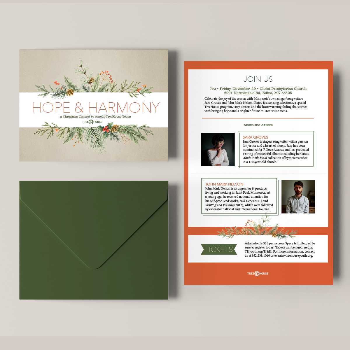

This annual benefit concert was in need of a classic brand. We used illustrations of the botanicals associated with the season, and used a warm red for the text. The venue for this concert was a church with dark brick interiors, so keeping the visuals simple and bright was essential.

