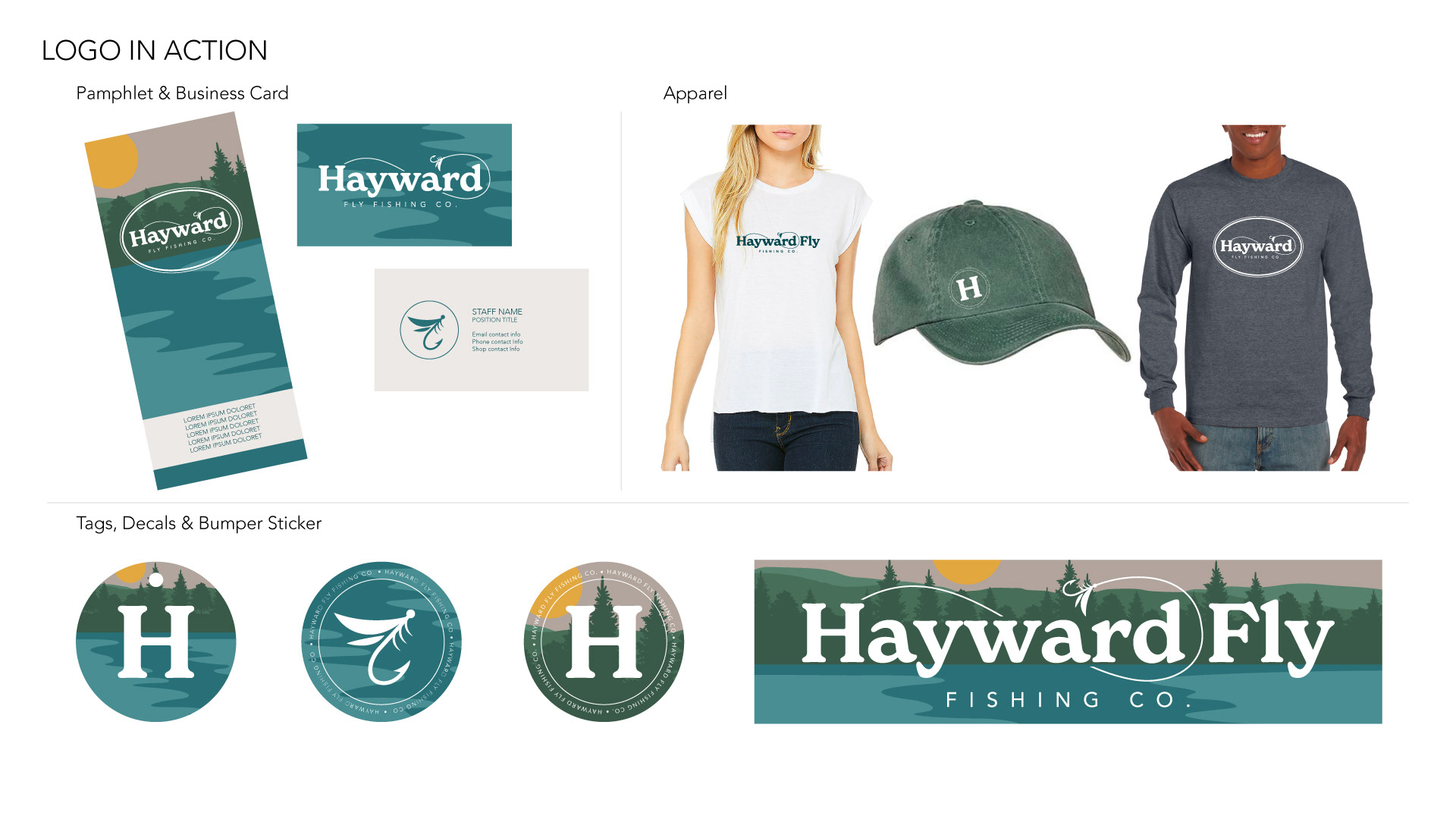
Following a change in ownership, the Hayward Fly Fishing Company was in need of an updated brand. We took inspiration from the old logo and the setting on the Namekagon River, but cleaned it up while keeping it clear and approachable. Versatility was a consideration from the beginning, since the logo and branding will be used for a shop sign, merchandise, as well as small print. The result is a set of flexible lock-ups, and a warm outdoorsy color scheme and illustrations.
This is an ongoing project, and I look forward to working on the other necessary aspects of the redesign including: a new website, small print collateral, merchandise, and more!
