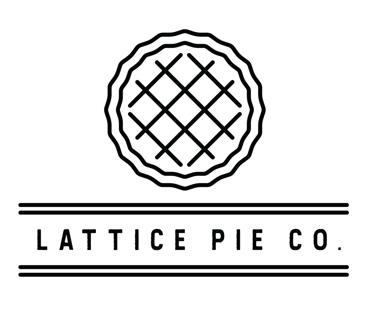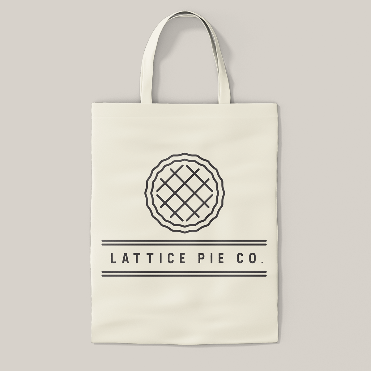


Sometimes simplicity is best. This client wanted a blend of rustic and modern, plus a pared back color scheme. We went through several different styles of icons, landing on one that was legible as a pie with minimal detail. That coupled with the right sans-serif font resulted in branding that is straightforward and versatile.
